Customization
Customize Chunkify Player colors, controls, layout, and templates.
Chunkify Player includes a default theme that you can adjust with colors and CSS. You can also register your own Media Chrome templates and select a theme for each player.
Set up the player before applying these options.
Colors and controls
The default theme provides these color options:
| HTML attribute | React prop | Purpose |
|---|---|---|
primary-color |
primaryColor |
Control foreground color. |
secondary-color |
secondaryColor |
Control background color. |
accent-color |
accentColor |
Color for active controls. |
In the default theme, set a button's CSS variable to none to hide it. Custom templates define their own button styles:
| Control | CSS variable |
|---|---|
| Play | --play-button |
| Mute | --mute-button |
| Captions | --captions-button |
| Picture in picture | --pip-button |
| Fullscreen | --fullscreen-button |
| AirPlay | --airplay-button |
| Cast | --cast-button |
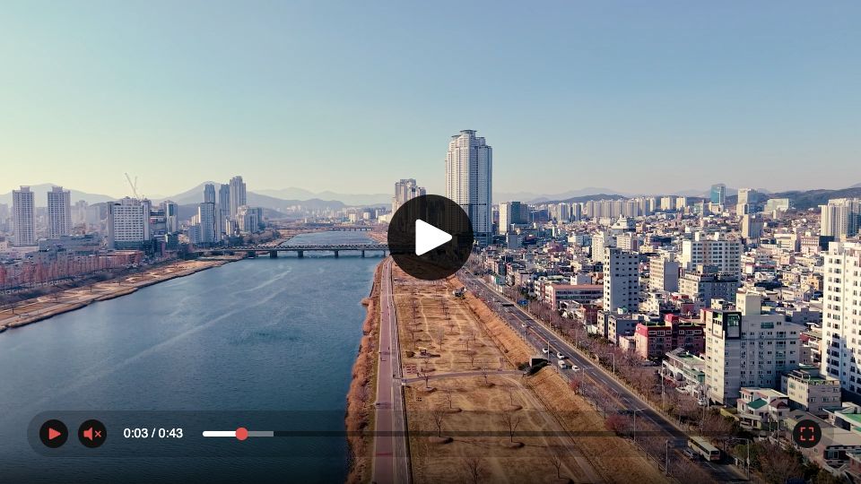
These examples use red controls on black buttons and hide the picture-in-picture button:
<chunkify-player
  src="https://media.example.com/videos/manifest.m3u8"
  primary-color="#ef4444"
  secondary-color="#111111"
  accent-color="#ef4444"
  style="--pip-button: none"
  crossorigin="anonymous"
  aspect-ratio="landscape"
  controls
  playsinline
></chunkify-player>
Size and cropping
Use aspect-ratio="landscape" for a 16:9 player or aspect-ratio="portrait" for 9:16. In React, use aspectRatio. You can also set another ratio with CSS.
The video keeps its original proportions with contain by default. Use cover to fill the player and crop the edges. This CSS works for both the web component and React wrapper:
chunkify-player {
    width: 100%;
    aspect-ratio: 4 / 5;
    --media-object-fit: cover;
    --media-object-position: center;
}
Use the theme and media CSS parts to target the controls container and media element. For example, change the default theme's timeline color:
chunkify-player::part(theme) {
    --media-range-bar-color: #ef4444;
}
The Media Chrome CSS variables available in a custom template depend on that template's styles.
Create your own template
You can build your own controls with a Media Chrome template and register it under a name. Each player can select a different registered template through its theme attribute or React prop.
The examples below create a compact theme with Play, a timeline, and fullscreen controls. Keep the media slot so the player can insert its video element.
Add the template and player to your HTML. The module script runs after the HTML has been parsed, registers the template, and then applies it to the player.
<template id="compact-player-theme">
  <style>
    media-controller {
      width: 100%;
      height: 100%;
    }
  </style>

  <media-controller>
    <slot name="media" slot="media"></slot>
    <media-control-bar>
      <media-play-button></media-play-button>
      <media-time-range></media-time-range>
      <media-fullscreen-button></media-fullscreen-button>
    </media-control-bar>
  </media-controller>
</template>

<chunkify-player
  id="custom-player"
  src="https://media.example.com/videos/manifest.m3u8"
  crossorigin="anonymous"
  aspect-ratio="landscape"
  controls
  playsinline
></chunkify-player>

<script type="module">
  import { registerPlayerTheme } from 'https://cdn.jsdelivr.net/npm/@chunkify/player/+esm';

  const template = document.querySelector('#compact-player-theme');
  registerPlayerTheme('compact', template);

  const player = document.querySelector('#custom-player');
  player.theme = 'compact';
</script>
With npm, import registerPlayerTheme from @chunkify/player in your browser code.
Template registration requires the browser DOM. Register each template once before selecting its name on a player.
After registration, select it with theme="compact" in HTML or React, or player.theme = 'compact' in JavaScript. Each player can select its own theme. Unknown names fall back to the bundled default theme.